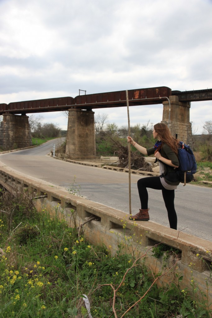
The pictures were taken and painstakingly analyzed. I spent hours looking at duplicate shots, deleting one here and one there, until I shaved it from 800 or so to 750 or so. They all looked the same, except for some minor details scattered about, and I wondered how I’d get down to one?
I didn’t give up though. I kept plugging along until I finally narrowed it down to five.
FIVE.
I felt a whole lot of accomplished at that point. My day was all rainbows and butterflies, until I asked myself the question, “Now what?”
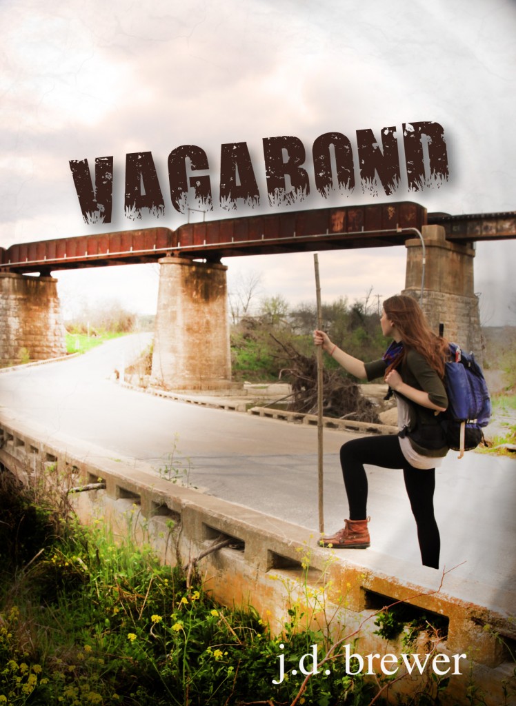
The one I’d chosen needed some severe photo shopping. My friend (and fellow indie-author), Sara Martin pointed out that Niko’s staff awkwardly cut into the train tracks, and there was a piece of trash just sitting there at the foot of my shot. (Hello, novice photographer J.D. Brewer.)
I needed photoshop, and I needed it hard.
Except I’ve never taken a graphic design course, and, as great as the pictures were, I had no idea how to turn them into a book cover! So, what does a modern woman do when she’s stuck? She’s puts the question out on Facebook. I’m a terribly blessed person in terms of friends, and so many knowledgeable people threw in their advice on programs to use and companies to visit. Then, an old high school buddy, KC, mentioned his wife used to do graphic design before she began teaching.
Enter Lynn Jones Hamilton, magic maker extraordinaire. As a former teacher, I know how hard it is to take time out of April, and I was beyond thankful that she was willing to sacrifice a bit of sanity to help me out. She ended up being the perfect person for the job. I had a very specific vision in my head, and it was like she took a walk in my brain and plucked it right out! So, here, is my official thanks to Lynn Jones Hamilton.
So, here’s a virtual tour of the evolution of my debut novel’s book cover!
THE BEAST
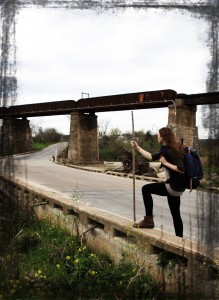
OH, WAIT. HERE’S LYNN TO SAVE THE DAY!
Note the absence of trash, shortening of staff, and all around doctoring up of my shoddy picture.
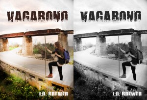
I chose the third one, because it had that sense of contradiction that happens so often in the novel.
WAIT. WHAT? I STILL NEED TO CHOOSE A FONT? AND WHAT WOULD HAPPEN IF WE BORDERED THE THE PHOTO? OH, AND IF KINDLE GRAY SCALES IT, WILL IT KEEP THAT FEELING THE COLOR ONE CAPTURES?
WHEW. GRAY SCALE IS OKAY. I LOVE THE ONE WITH THE TITLE RESTING ON THE TRACKS. WHAT WOULD IT LOOK LIKE IF WE CENTERED IT?
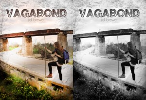
WAIT! SHUCKS! I DIDN’T NOTICE THE COMMERCIAL USE OF FONTS REQUIREMENT. LET ME CONTACT THOSE ARTISTS. OHHHH. THOSE ONES ARE EXPENSIVE. LET’S TRY THIS ONE!
AND A BOOK COVER IS BORN.
Seriously, I can’t thank Lynn Jones Hamilton enough for her mad graphic design skills. It was so neat to watch the entire process unfold, and I’m pretty sure she’s a saint in terms of patience.
So, get excited about Vagabond. It debuts mid-May 2013.


